SEO Basics for Squarespace Websites - Mini Series (1 of 4)
We all want to show up as the top result on Google, and we want it now. Unfortunately, that’s just not the way Google likes to play. Ranking well in the SERPs (Search Engine Results Page) is something that requires dedication and time. There’s no cutting corners in this game (and don’t try, or Google will give you the ax), so brew up a fresh pot of coffee and let’s get to work.
Over the next four blog posts, we’ll cover the basics on how anyone (non-techies included) can improve the SEO on their websites. Check back on Wednesday, Friday, and next Monday for the rest of the series!
1. SIZE YOUR PHOTOS CORRECTLY
Google wants to give its users websites that are fast because the faster the load time, the happier the searchers. So if you're thinking of posting a bunch of 10 MB unscaled photos of your kitten, don't. While they may be cute, they definitely won’t score you any points with Google.
When you post an unnecessarily large photo, you increase the load-time and bandwidth burden (how much data can be sent and how quickly). This ultimately means painfully longer load times. The good news is that this is an easy fix!
HOW TO MAKE YOUR PHOTOS SMALLER:
Before you open your file up in a photo-editing software, you'll need to know the dimensions of where you plan to put your photo on your site. Typically the page width of a standard website is between 900 - 1200 pixels wide. For example, if you know you want a photo to take up half of this area, you'll want to save it at around 600 pixels wide.
Photoshop is my weapon of choice when scaling images since I can also make other edits and tweaks at the same time. Simply go to file > 'save for web' and enter your preferred dimensions when saving.

If you don’t have Photoshop, don't fret! You still have a options for resizing. If you’re using a Mac, open up the Preview app. Select tools > 'adjust size' to bring up the resize dialog. If you’re using Windows, just open the file in Paint. Select 'resize' from the home menu and enter the new dimensions.
Make sure to make the photos going on your website are as close to the size that they need to be. Having a photo that is 3000 x 1000 pixels inserted into a 900 x 300 pixel spot will waste precious bandwidth! There’s no need to make the photo such a high resolution, so make sure you scale each picture to the precise dimensions needed for each spot on your website.
SMART COMPRESSION:
When a photo is saved, there are all sorts of extraneous details tied to that image file. A trick I've found to make your photos even smaller for the web is to use a smart lossy compression tool. My favorite for JPEG and PNG files is tinypng.com. It's free, and only takes a few seconds per image file. It's so simple to use- after you've saved your file in the appropriate dimensions, just upload it to TinyPNG. After TinyPNG processes the image, you can download it and use it where ever you need on the web!

Here's how it works according to TinyPNG: "When you upload a PNG file, similar colors in your image are combined. This technique is called 'quantization'. Because the number of color is reduced, 24-bit PNG files can be converted to much smaller 8-bit indexed color images. All unnecessary metadata is stripped too." Genius!
If you're a photographer or similar and can't afford to lose even an ounce of sharpness/clarity to your photos, you can use a 'lossless' compression tool. For lossless compression, check out Compressor.io's site. You may not see as great of a reduction in file size, but the clarity of your photos won't suffer.
2. MAKE YOUR SITE MOBILE FRIENDLY
One of the most significant changes to Google’s algorithms came this April with the mobile-friendly update that affects all websites shown on its search results. This update not only favors mobile-friendly websites in the SERPs, but actually penalizes sites that are not optimized for mobile devices. This is huge, so make sure your site is mobile friendly! If you’re using SquareSpace, you’re already covered. All of SquareSpace’s themes are designed to be automatically mobile-optimized without you needing to lift a finger. Whew!
If you’re on Wordpress though, you’ll definitely want to check out your theme. Many themes offer a responsive layout which is oftentimes recognized by Google as mobile friendly. Themes on the Genesis Framework are usually a safe bet. (Note: I am not an affiliate of any companies mentioned on this blog. All recommendations are from personal preference and use.) See below for my favorite Wordpress themes.
HOW DO I KNOW IF MY SITE IS MOBILE FRIENDLY?
Click here to test out your website on Google’s Mobile Friendly tool- it's the only way to be positive you're in adherence to Google's new algorithm changes.
3. CHOOSE A GOOD THEME / PLATFORM
Choosing a quality platform is at the start of all SEO. If you’re in the Squarespace platform, you don’t need to worry! The themes in the SS platform are all well-coded and include updates, site maps, etc. This section is mostly for you, Wordpress lovers! Choosing a quality theme is essential in terms of SEO in Wordpress. Google prefers sites that are cleanly coded, using proper and valid HTML, clean structures and more.
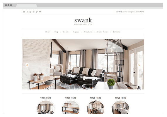
Swank Theme by Pretty Darn Cute Designs
Hands down, the best theme I have found for quality code that is optimized for SEO are themes built on the Genesis framework. Genesis is the parent theme, with hundreds of theme-babies created by many talented website developers. Although the Wordpress sites I design for my clients use custom development rather than pre-made themes, I still recommend using a Genesis theme to anyone who wants to 'DIY' a website. Some of my Wordpress theme companies are RESTORED 365 as well as PRETTY DARN CUTE.
Like what you just read and can't get enough? Check back on Wednesday for even more tips and tricks to mastering SEO.
Loved this post and want more information on SEO basics for Squarespace?
Check out the rest of the series here: